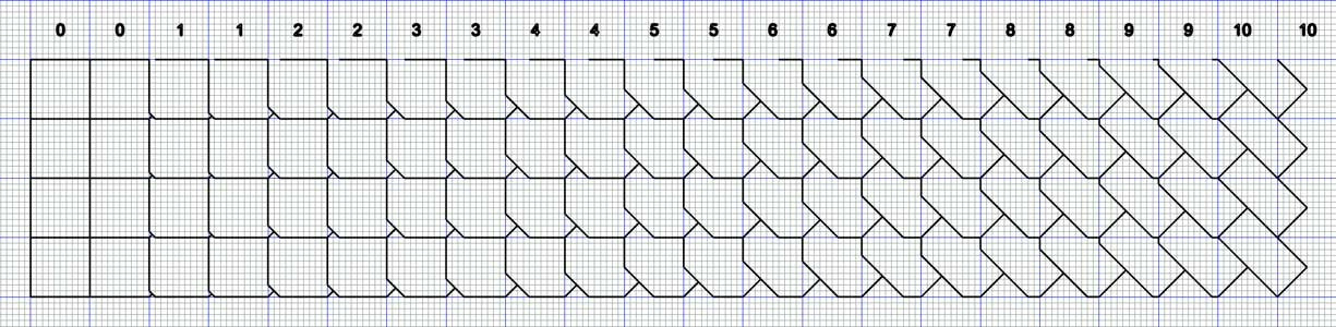
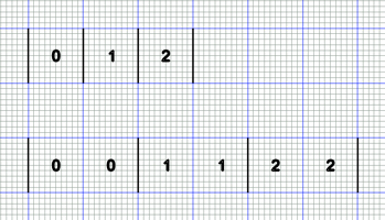
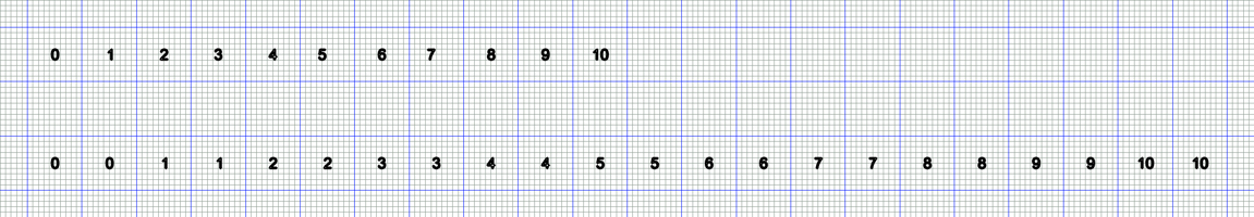
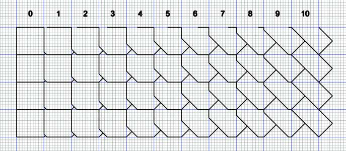
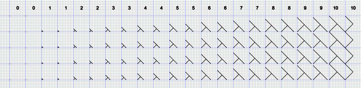
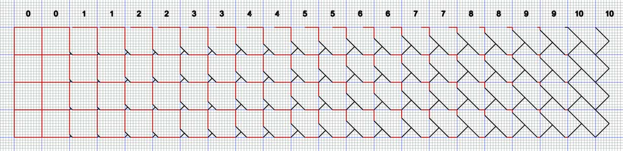
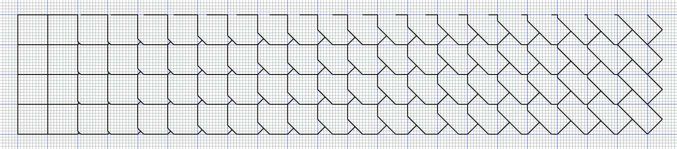
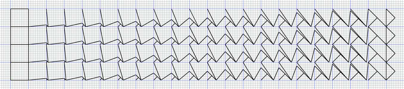
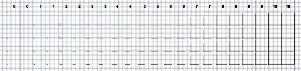
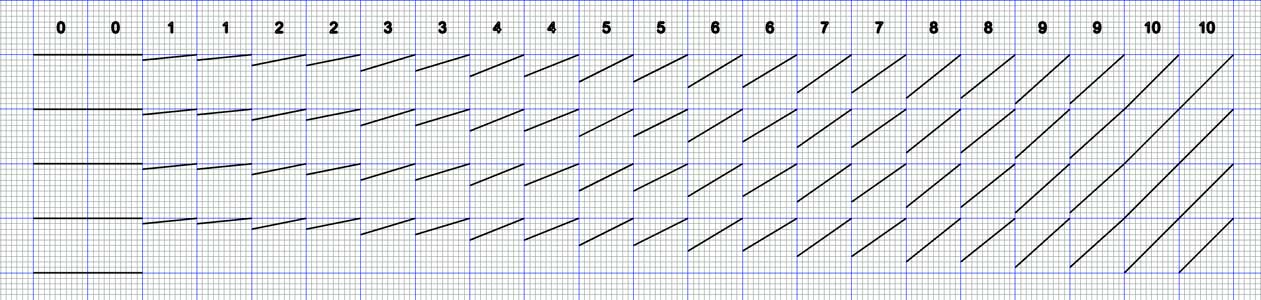
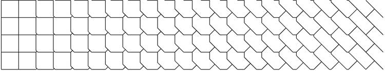
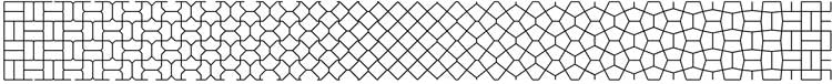
The background to this tutorial is, or was intended, as a 10-12 page article for a forthcoming book on parquet deformations by Werner Van Hoeydonck. However, we couldn’t agree on the content, and so the idea was, in early May 2021, abandoned. That as shown below was my preferred version. Within the limitations of a 10-12 page article, I consider that it gives a good introduction to the practical side of the subject, namely the creation process, and so rather than dispense with such a considered piece, I have simply added the article to my page. Note that the tutorial is within the constraints of the page length mentioned. In many places here, the explanation was of necessity short (but still exact as could be), and of which I would have liked to have elaborated and added more detail. To this end, in due course, I will do so, with the luxury of as many pages provided by a web page, and so have an exhaustive treatment for any one aspect, but this may take some time. This will build on the framework here but will be separate. Meanwhile, the (rejected) tutorial will serve. Upon completion, the rejected article, having served its purpose, will be replaced by the more all-encompassing tutorial. Introduction The designing of parquet deformations is perhaps less than obvious, even to the mathematician, with essentially next to nothing in the way of a simple, straightforward tutorial. At best, there is a series of guidelines, and nothing more, and even these are in typically obscure, hard to obtain, or even unpublished manuscripts [8], [*]. To this end, I now give a tutorial as according to my own interpretation of the design process, based on my 33 years of interest (admittedly, at intervals, and considerable at times), in which I deconstructed the parquet deformations in Douglas Hofstadter’s landmark article [5], in which they were popularised for the first time. Although the article is admirable in many ways, being replete with outstanding parquet deformations from William Huff’s students, as well as concepts, analogies with music, temporality, and overall philosophy, it is not a tutorial as such. This would have been clearly beyond its scope, and so is not a critique. Generally, the discussion and presentation of parquet deformations have followed in this line, without any tutorial element, for no good reason; there is nothing advanced mathematically to explain this omission. Therefore, essentially for the first time, I thus correct this oversight with a tutorial open to all, mathematician or otherwise. Although ostensibly mathematical, or perhaps more exactly geometrical, any perceived lack of mathematical knowledge or ability is not a hindrance in practice. Indeed, beyond basic knowledge of tiling, polygons and unit cells, arguably there is no mathematical/geometry knowledge required here at all! Indeed, at its simplest, as exemplified by the William Huff-student inspired works, it is really a design matter, essentially drawing a series of (typically) straight lines with a ruler on interstices on graph paper; there is no mathematical calculation as such involved. However, that said, for the more advanced concepts as exemplified by Craig Kaplan’s work [1], [2], [3], such knowledge of advanced university-level mathematics is indeed required. However, this is very much the exception to the rule. Whatever one’s mathematical ability, it is still possible to design outstanding instances as to the Huff archive standards. The effect is one of relative mathematical sophistication that belies the sheer simplicity underlying the creation as I will show in the tutorial. I presume a degree of familiarity with the idea. Underpinning the tutorial are a whole host of underlying issues, of which not although essential, is certainly desirable to grasp to better understand the subject. I give the tutorial in two parts. Part 1 is the theory, whilst Part 2 is practice. The tutorial is restricted to that of linear, one dimension, square-based instances. This can be regarded as the core-value starting point. Ideas and concepts arising from this can then suitably be adapted to other lattices, such as equilateral triangles or hexagons, as well as expanding into two dimensions. The approach is using the same ‘pen and paper’ methods in Huff’s time, but suitably updated for the computer age, with computer-drawn diagrams. The tutorial can be considered as an introduction to the subject; more advanced concepts, albeit still of the same simple processes, can be found on my website [4]. Underlying Issues Defining Defining a parquet deformation is not perhaps a straightforward task as might otherwise be thought. Huff [5] gave a strict criterion of a monohedral tiling with a condition of handedness, leading to what he terms as ‘proper’ and ’improper’ parquet deformations [11]. However, Hofstadter [8] then amended Huff’s monohedral tiling condition. However, Grünbaum and Shephard [*] took issue with Hofstadter’s description of a monohedral tiling [*]. And then Huff [13] told me by his own criteria, some of my own parquet deformations which I considered to be so e.g. Fig. * are not ‘proper’. Therefore, the situation is less than exact. Be that as it may, I consider Huff’s restriction of handedness far too severe, and of which if followed slavishly rules out many instances of true worth, comparable in quality to his ‘proper’ parquet deformations. Therefore, although retaining much of Huff’s criteria, I thus include instances of handedness in my (implied) definition. Aesthetics Of fundamental importance is what I term, as Huff himself did [11] is the aesthetics of a parquet deformation. In short, whether this has artistic integrity, or, even blunter, is good or bad. It is a relatively easy task (especially with computer assistance) to compose numerous parquet deformations, essentially to the point of triviality. However, not all can be described as aesthetic, which of course should be the standard to aim for. So, what is it that makes for an aesthetic parquet deformation? As such, this is perhaps somewhat subjective; a strict set of rules is difficult to define. Symmetry is a rough guideline but is not infallible. Instances that are symmetrical can be described as aesthetic and non-aesthetic, whilst instances that are non-symmetrical can also be described as aesthetic and non-aesthetic. This I discuss and illustrate below. Hand-drawn versus computer-drawn Since William Huff’s day, with archived hand-drawn parquet deformations dated 1963-1998, the computer has been used more and more in all manner of everyday life, and as a corollary, of artistic endeavours, in the broadest creative sense. An obvious question to ask is whether the computer can improve, loosely defined, on the hand drawn parquet deformations and perhaps take this even further, in new directions that would otherwise be impractical by hand. There are many issues here, but perhaps the most important is that of the actual drawing. By hand, this is most time consuming and limited in scope; every line is unique, does not permit revision and large-scale repetition is largely impractical. In contrast, by computer, this allows for swiftness of execution, copy, revision, and repetition with ease. What would take hours in Huff’s day can now be accomplished in a few minutes. Further, one can explore further possibilities of superposing, involving mathematical operations of rotations, translations and reflections. This is largely impractical by hand; the time factor here is even more of an issue. However, as demonstrated by the Ulm archive [*], with on occasion parquet deformations of great complexity, the computer is not strictly necessary for outstanding works. That said, I am now firmly on the side of computer use. Indeed, the computer can be said to be made for parquet deformation. One can simply do more, better, and quicker. Describing The Two Types The Huff-student works can be described broadly as of two types, of ‘simple’ or ‘intricate’. Both types can be seen in Hofstadter's article e.g. Fylfot Flipflop and Arabesque, respectively. As a rule, I favour drawing the simpler type, in both aesthetics and practical terms. To me, the complicated instances appear to be out of all proportion as to the inherent worth, as much as they can indeed be admired. The time taken, for what must have been countless hours and days, if not weeks, seems questionable. I could easily imagine that this would require the same time as say of ten or more simple deformations. I can certainly appreciate them, but can the time expanded be justified? For me, no. On such grounds, I summarily dismiss such types in the following tutorial. In contrast, to me, the more simple types, typically featuring basic, ‘core value’ tiles, hold more appeal. Presentation The presentation of the student works in the typical strip form, in terms of the unit thickness used, varies a great deal. The minimum is three, e.g. Mission, with more typically 6-8 units used. An open question is to the ideal thickness, in terms of units, of the strip. This is somewhat subjective; there is no one single best. And then there's the matter of hand-drawn vs computer-drawn to consider. In Huff’s day, the process of drawing many strips, loosely defined, would have been most laborious. In contrast, with the copy and paste facilities of the computer, a single, initial strip can be repeated in moments any number of times and so can considerably be expanded with ease. Be that as it may, the matter is best addressed by ignoring the two processes as concepts and instead consider the matter from a design viewpoint. A minimum strip, of 2 units (to show the repeat nature of the tiling), is judged too brief. Although this is sufficient to show the tiling premise, this is only barely so and can be considered as parsimonious in the extreme. On the other hand, a strip of say 10 units (or more) is judged more so than is necessary to show the tiling premise. In practice, I find that 4 units, commensurate with a square here, are judged ideal. However, 6 units are still an eminently viable proposition, and perhaps even 8 units. Matters are also complicated by the deformation expanding. A tiling rule that I follow, of my own devising transposed to parquet deformations, is that when one can see that the repeat nature is obvious then there is no need to show more, and so 4 units are judged as ideal. Colour Invariably, the student parquet deformations are shown without colour, but the reasons why is not discussed in the literature. However, there is a reason for the omission. In private correspondence [14] Huff told me: Incidentally, while we were studying "pure" parquets---no deformations, we did color many of them black and white, etc. But when we concentrated on the parquet deformation, we did not "color" them, because we saw the beauty in the line.....the shapes of the tiles were secondary...not unimportant, but secondary. One can surmise here that colour would be a distraction from the core premise. Be that as it may, colouration remains a possibility, essentially as an addition, or an option, to the core-value line deformation, but it is not an important matter in itself. Indeed, although the possibility seems obvious, this is generally neglected by the designer. One notable exception is that of Kaplan [1]. Here he shows computer colouration instances, of map colouring contrasting colours, as well as gradients. A possibility is that of using different coloured lines, where the deformation is in effect an overlay, for example, Fig. *. Whatever, it is not a point of undue concern. Rather, colour should be considered as an addition or option.Tutorial Part 1 - Theory I begin the tutorial by explaining the numbering, or more exactly what I term as the ‘beats to the bar’ and ‘tempo’, of the following parquet deformation (Fig. 1), which serves as an exemplar for the succeeding parquet deformations set up. The music terminology follows in Huff’s [10] and Hofstadter’s [5] footsteps. In the same vein, I continue the analogy in my own way. Fig. 1. Exemplar Parquet Deformation. Beats to the Bar and Tempo A core important aspect to consider of parquet deformation (but not of the design process itself), is that of the beats of the bar and tempo, which are separate but related aspects. The beat refers to in effect distinct stages of the parquet deformation, whilst tempo refers to the predetermined length or number base. I discuss each in turn below. I begin with an abstract study of both aspects, to establish the premise, without a parquet deformation. This is then followed by application, with a parquet deformation. For demonstrative purposes, I use the same parquet deformation throughout for the sake of consistency, chosen for its aesthetics and ease of drawing. (i) Beats to the Bar By beats to the bar (or stage), I mean the repetitive nature of the unit cell. 1-beat would be 0, 1, 2..., whilst 2-beats would be 0, 0; 1, 1; 2, 2... etc., Fig. 2. Of course, even more beats to the bar are possible, although in practice serve little purpose beyond bloating the composition, save for on rare occasions when 3-beats are required (to preserve the tiling condition). Fig. 2. Beats to the Bar. (ii) Tempo By tempo, I mean the cadence of the composition. The tempo can be of any length, although in practice I generally favour a tempo of 10, for reasons as I detail below. Fig. 2 shows a tempo of 10 for both 1-beat (top) and 2-beats (bottom). Fig. 3. Tempo. 1 Beat to the Bar (Upper), 2 Beats to the Bar (Lower). Application I now turn to matters of application, with two exemplar parquet deformations based on Fig. 2 and Fig. 3, with Fig. 4 and Fig. 5. Fig. 4. Parquet Deformation of 1-Beat to the Bar. Fig. 5. Parquet Deformation of 2-Beats to the Bar. There are obvious differences here, in two main ways: (i) The physical length of the respective compositions, which doubles. (ii) The all-important condition of tiling. 1-beat will not tile, whilst 2-beats will tile (of alternate columns). The physical length of the composition is inconsequential in itself. Whether the loss on the condition of tiling is acceptable is a moot point. In his two conditions [5], Huff rules non-tiling types out. However, many examples of this type can be seen in the student work, and so presumably this must have met with his approval. Of the two types, I greatly favour 2-beats. To me, the condition of tiling is a major factor that cannot be overridden. A 1-beat can thus be described as a ‘curtailed’ tiling. However, this curtailed tiling does have its place. It is perhaps better employed on two-dimensional studies, as this can in practice leads to practical difficulties when drawn out in full, as a 2-beat. Such compositions in terms of the number of tiles may otherwise involve hundreds of tiles, which can quickly become overwhelming. Such additional matters aside, my choice for linear strips is 2-beats. Having thus determined the ideal beat, the question of the tempo now arises. But what is the ideal tempo? In short, this is to a degree subjective. A rule I follow is that the change between the tiles at each stage should be perceptible, but not to an abrupt or imperceptible degree¹. As abstract concepts, this is neither too ‘quick’ nor too ‘slow’ but rather somewhere in between. A ‘quick’ example would be where the change is too drastic, of just a cycle of say, 2 or 4 stages. This would result in a too abrupt a metamorphosis and would be jarring to the eye. On the other hand, a ‘slow’ instance, of say 20 stages, where the change at each stage is not perceptible, would make for tedious viewing on grounds of excess length. A tempo of 10 is judged just about ideal, neither too quick nor slow, although there is no firm single choice. Close tempos on either side of this, of 8 and 12, are still deemed permissible within an aesthetic range. However, below and beyond this point, with tempos of 6 and 14, these become a little too quick and slow respectively, and furthermore, with ever-declining and increasing instances even more so, are thus deemed unacceptable. Therefore, the default beat is 2 (0, 0; 1, 1…) with a tempo of 10 (0-10). Part 2 - Practice Forming Parquet Deformations - The Bailey Method With the tempo and beat issues addressed and a default determined, I now turn to practical matters of the design process. As alluded to in the introduction I am unfamiliar with any simple, straightforward guidelines in the literature. The following is how I deconstructed the simple parquet deformations in Hofstadter’s article, based on a square lattice, with simple, incremental geometrical motifs. Although it is not known exactly the methodology Huff taught, the method shown below was surely used, if not directly, then in principle. To clearly delineate this, I will thus refer to this as the ‘Bailey Method’. Note that a feature of this way of designing is that the finished deformation is not predictable, often resulting in a pleasing surprise upon completion. Note that this is not the only way of designing; there are other ways of forming parquet deformations: (i) Beginning with an arbitrary tiling, e.g. of regular hexagons. The tiling is retained as a framework throughout, as a lattice, in which changes to the sides are made by a deform device as given by Huff, above. Such instances include Trifoliate. A feature of this way of designing is that the finished deformation is not predictable, resulting in a pleasing surprise upon completion. (ii) Predetermined tile to tile. A fundamentally different, and more specialised type of approach to the above essentially experimental methods, is to begin and end a parquet deformation with a certain tile in mind. This can be much more involved, at times requiring advanced mathematics; see Kaplan [2], where he transitions the Laves tilings. Below I show the standard form of a typical deformation using what I term as the Bailey method, seemingly different to the Huff-type, or at least can be interpreted as such. This is of a strip shown horizontally, reading from left to right. Typically, this is square-based, and which I adopt as the default starting point. The same principles can then be extended to other lattices and configurations/formations, such as isometric, hexagons and into 2 dimensions. Square lattice, with simple, incremental geometrical motifs As alluded to above, the default arrangement is of 10 divisions of a unit cell, with a tempo of 0, 0; 1, 1, 2, 2… 10,10, of a 4-unit strip. I begin purposefully with a simple idea but by no means the least effective. Upon the square lattice, I add an expanding incremental ‘T’ set at 45° at the vertices of the square cell, until at the end of the series the lines join up, and so this thus completes its cycle; no more continuation/expansion is possible. This then serves as the basic framework, Fig. 6 (I show other incremental motifs after the discussion, Figs. 9-10.) Fig. 6. Basic framework. A typical example of a square lattice, with simple, incremental geometrical motifs. Ideally, copies are then made of this, for experimental purposes. I now simply experiment with joining up lines in an ordered way, of which the joins at times are obvious (as shown), but are by no means trivial in the resulting parquet deformation. Here, with a red line to better show the process, from the end of the extending line I then join to the vertices of the square, Fig. 7. Fig. 7. Joining lines to the framework of Fig. 6. For the completed work, I thus show the processes above without any intermediary steps, Fig. 8. Fig. 8. The completed parquet deformation. The result is most gratifying aesthetically and in the tiles used, or more accurately, so formed. The square transitions to a rectangle (of basic, core-value tiles), in a very smooth and flowing manner, and further with the additional pleasing aspect of mirror symmetry (although not necessarily as a consideration of aesthetics). Aesthetically, I consider this instance elegance personified. Indeed, typically, the more obvious joins lead to better aesthetic instances, as here. Not all are so for any one lattice, however. I show a counterexample based on the same lattice below, Fig. 9. In contrast, the joining here, although admissible as a parquet deformation, can be described as of poor aesthetics. Although the beginning is as above, and then the central regions are acceptable, as the deformation progresses further and further to the right, the tile (which also lacks symmetry, but is not in itself a precursor to aestheticism) becomes angular towards the completion of its cycle, with the ending of a subdivided rectangle in an inelegant, asymmetric way. As such, it clearly lacks the elegance of Fig. 8. Fig. 9. Unaesthetic joining. Of course, there are many more geometrical motifs possible. Below I show two other lattices, of chevrons and a straight line that have been used for aesthetic works, see Figs. * and *. What is striking is how simple and yet so effective the device can be; even a straight line has exciting possibilities! Fig. 10. Lattice of Incremental L‘s. See Fig. * for a parquet deformation based on this. Fig. 11. Lattice of Straight Lines. See Fig. * for a parquet deformation based on this. Aesthetic and Non-Aesthetic Parquet Deformations As alluded to in the commentary, not all parquet deformations are aesthetic as another. Below I show all four combinations of aesthetic/non-aesthetic, and symmetrical/non-symmetrical instances, Figs. 12–15. Without too in-depth an analysis, the aesthetic instances, Fig. 12 and Fig. 13 transition from basic, core-value tiling polygons of a square to a rectangle and two right-angled triangles (set within a square) to rectangles respectively, in a natural, flowing manner. In contrast, the non-aesthetic instances, Fig. 3 and Fig. 4, although beginning also with core value tiling polygons, two right-angled triangles (set within a square) and a parallelogram, simply do not flow, and can be described as jarring and ‘unnatural’, elongated tiles respectively, and furthermore, transition to essentially nondescript tiling polygons within a square. Detailing exactly the differences is not straightforward, but the most obvious test is a simple, visual one, of which at-a-glance matters of aesthetics are, or should be, self-evident.
Fig. 12. Aesthetic, Symmetrical. 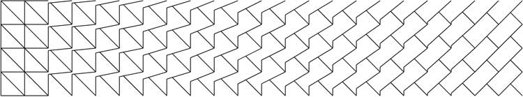 Fig. 13. Aesthetic, Non-Symmetrical. 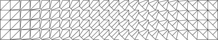 Fig. 14. Non-Aesthetic, Symmetrical. 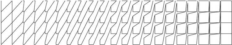 Fig. 15. Non-Aesthetic, Non-Symmetrical. Aesthetic Parquet Deformations Having thus established the basic principles of aesthetics, I now show a variety of parquet deformations of what I term as aesthetic of the highest standards my own, formed by the methodology above. 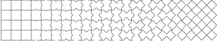 Fig. 16. Transition from squares to squares at 45°. 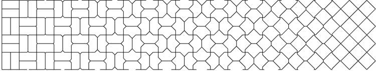 Fig. 17. Transition from double basket weave to squares at 45°. 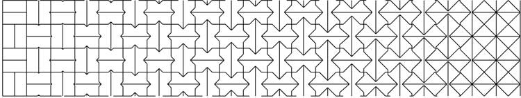 Fig. 18. Transition from double basket weave to four right-angled triangles within a square. 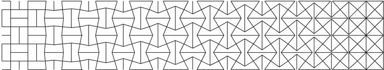 Fig. 19. Transition from double basket weave to four right-angled triangles within a square. 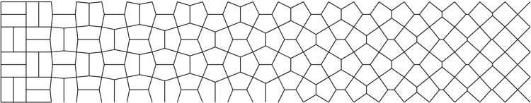 Fig. 20. Transition from double basket weave to squares at 45° 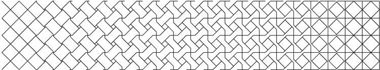 Fig. 21. Transition from a square at 45° to four four right-angled triangles a square at 45° within a square. 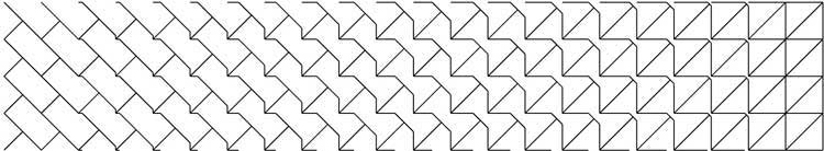 Fig. 22. Transition from a rectangle at 45° to two right-angled triangles within square. 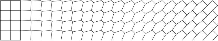 Fig. 23. Transition from a square to rectangle at 45°. Further Possibilities - Super Parquet Deformations An observation is that some of the above parquet deformations share common tiles. For instance, Fig. 20 and Fig. 17 have common elements of a double basket weave tiling. An obvious possibility is thus joining these to form a 1 x 2 strip, of what I term as a ‘super’ parquet deformation. Fig. 23 and Fig. 24 show two examples of 1 x 2 strips. Of course, the process can be continued to form 1 x 3, 1 x 4… strips. 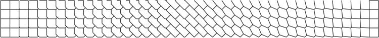 Fig. 24. A 1 x 2 Super Parquet Deformation, formed by joining Fig. 12 and Fig 23.
Fig. 24. A Super Parquet Deformation, formed by joining Fig. 17 and Fig. 20. Acknowledgements Claudio Guerri and Nick Bruscia, for making available unpublished and hard to obtain material by William Huff. Maurizio Sabini, for his recollections of his student days with William Huff. Werner Van Hoeydonck, for comments on the manuscript. References [1] Alex Bellos. ‘Crazy paving: the twisted world of parquet deformations’. The Guardian, 9 September, 2014. [*] Branko Grünbaum and G. C. Shephard. Tilings and Patterns. W. H. Freeman, 1987 [2] Craig S. Kaplan. ‘Metamorphosis in Escher’s Art’. In Bridges 2008: Mathematical Connections in Art, Music and Science. Tarquin Publications, pp. 39–46. [3] ————. ‘Curve Evolution Schemes’. In Bridges 2010: Mathematical Connections in Art, Music and Science, Tessellations Publishing, pp. 95–102. [4] David R. M. Bailey. David Bailey’s World of Escher-like Tessellations. http://www.tess-elation.co.uk/parquet-deformation (Accessed * April 2021) [5] Douglas R. Hofstadter. Metamagical Themas. ‘Parquet deformations: patterns of tiles that shift gradually in one dimension', Scientific American, Vol. 249, No. 1 July 1983, pp. 14–20. [*] HfG Archive Ulm. [6] William S. Huff. ‘An Argument for Basic Design’. ulm 12/13, 1965, pp. 25–38. [7] ————. ‘An Argument for Basic Design’. In Urban Structure by David Lewis (ed). Architects' Year Book: Urban Structure, Elek Books, 1968, pp. 269–278. [8] ————. The Parquet Deformations from the Basic Design Studio of William S. Huff at Carnegie-Mellon University Hochschule für Gestaltung and State University of New York at Buffalo from 1960-1983. [9] ————. ‘What is Basic Design?’ In Robert A. Crowell (editor). Intersight One. State University of New York at Buffalo, 1990, pp. 76–85. [10] ————. ‘The Landscape Handscroll and the Parquet Deformation’. In Katachi U Symmetry. Ed. Tohru Ogawa, Koryo Miura, and Takashi Masunari. Tokyo: Springer-Verlag 1996, pp. 307–314. [11] ————. Private correspondence. 23/1/2003 email. [12] ————. Private correspondence. 17/12/2003 email. [13] ————. Private correspondence. 1/4/2008 email. Page Created 14 May 2021. |
Parquet Deformations >