As
such, this motif should self evidently be seen as of an intrinsically high
quality, as ‘proportionally' it is well nigh perfect in this aspect, of which
such an achievement is notoriously difficult. Indeed, of all my motifs, and not
only of human figures, I rate this particular example most highly, a
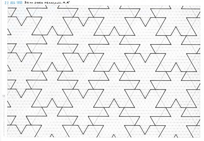
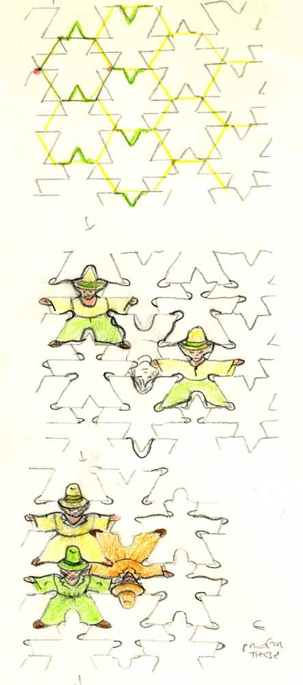
superlative, an ‘all-time favourite' of mine. Source Study Sheet (three diagrams) The study sheet shows the beginnings of attempts at improving upon the initial outline. I might just add that these are of a very ‘rough and ready’ nature, even for a study. The reason for such a slapdash approach was that these date back to some of my earliest studies of all, when I was less concerned with accuracy of drawing than I would be today. However, although they are not of an ideal nature, they more than suffice for study purposes. I begin by examining the symmetry arrangements of the tiling. As can be seen, this is based upon a regular hexagon, with two different sides possessing 180° rotational symmetry, whilst the third is of a translation. Therefore, the changes, in the desire of improving upon the initial, somewhat stilted figure, are based on these symmetry arrangements. Although a human-like figure is
broadly discernible in the initial figure, it is lacking in articulation in many
different ways. From top to bottom, its shortcomings include: a pointed top
of head, no definition of the neck, no hands, no definition of waist, and no
feet. Of these concerns, some are more important than others. Most noticeably,
it lacks both hands and feet. Also, there is a decidedly awkward ‘protuberance’
at the top of the head. Therefore, these concerns should be the first ones
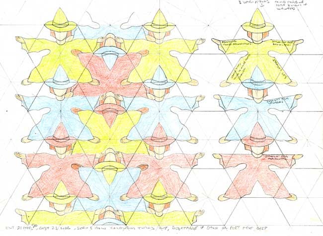
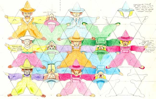
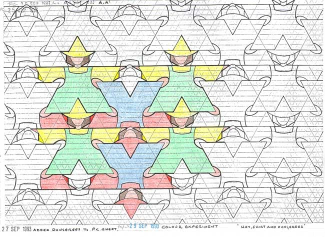
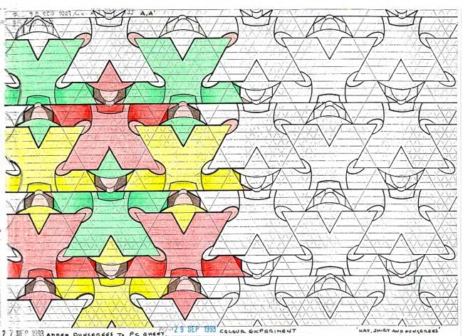
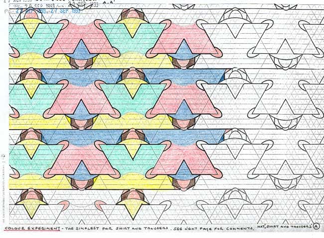
addressed. So, I begin with giving the figure hands, with just a very simple 'partial ellipse'. Naturally, the addition of hands also has implications elsewhere, in that changes have been made to the original line elsewhere. In this instance, where the line is changed to include a hand, this also affects the neck region. Pleasingly, this is for the better, in that the neck region is now more clearly defined than previously. Previously, this lacked any definition whatsoever, with the head being simply 'attached' to the body. This can be described as a win/win situation, in that the changes made are also for the better elsewhere. Such a win/win situation is most rare. Often, when making a proto change, this affects the motif in a detrimental way. For example, on another tessellation with a different symmetry, with the addition of a hand that ‘improves’ the motif, this may wholly distort another part of the motif to an unacceptable degree, and so the proto change has to be rescinded. As the motif lacks feet, this is then again tried out, with yet another simple 'partial ellipse'. Again, the addition also has implications elsewhere, in that changes occur. When the foot is thus added, this also affects the waist region. Pleasingly, this is again for the better, in that the waist region is more clearly defined. Previously, this lacked any definition whatsoever. Again, as detailed above, such a win/win situation is most rare. Another concern is the ‘pointed protuberance’ on the top of the head. As such, ideally this would be rounded of, and indeed this is tried. However, as the original line clearly defines the inner legs of the trousers, and so if the basic outline is radically changed (i.e. rounded of), than so this true-to-life feature would be lost. However, to show a human with a pointed head would be most jarring. Therefore, the option is to try and workaround this. Typically in this situation, and one that frequently is used, is that of equipping the figure with a hat. This thus allows the outline to be preserved, but allows the head ‘below’ to be more true-to-life. Arguably, the shoulders are a little ‘stiff’, of a straight line, of which ideally these would adopt a more rounded appearance. Again, this affects the motif elsewhere, namely with the outside of the trousers. When so changed, these give a naturally looser, less rigid appearance. Again this is yet another win/win situation, but of less significance than that with such basic features of hands and feet. With the addition of these changes, the motif is now considerably better, i.e. more life-like than the initial tiling. Such experiments, in the desire of improvements, are the very essence of what tessellation art should be about. Although I could have simply added interior detail to the initial human-like tiling, and leave it at that, as a human-like tiling, albeit of a somewhat contrived nature, as most other people would do, this to me is just sheer laziness. The challenge is to refine the initial proto human-like outline to an unmistakable one, and not simply accepting the first resemblance to, in this instance, a human figure. Study Semi-neat Tessellation Semi-neat Tessellation Free Experiments Upon having established the figure as an outline, the question arises of the interior design aspect. With a human figure, there is more choice here, in contrast to animals, for obvious reasons. At this stage, one should experiment quite freely, without fear of failure. If something succeeds, then great, but if not, it’s an experiment, failure should be expected. Once something has been established as potentially favourable, this can then be examined in greater detail. This study shows the first attempts at a meaningful interior design, in which the figure is clothed in a variety of ways. For example, different viewpoints of the hat are tried, with it being viewed both from above and below. Different viewpoints of the head are tried, with the head looking more or less full on, and looking down. As can be seen, it is quickly established that from above is superior, of which this serves as the basic model. Even the positioning of the features of the head is different, with the hat obscuring the eyes, as well as the full face being visible. It is quickly established that the face is best seen with as much detail as possible. The figure is dressed in a variety of ways, with shirt and trousers, a three piece suit, and dungarees. It is quickly established that dungarees are best. Such experiments should be second nature to the tessellator, in that one should constantly be searching for the ideal outdone to a given set of circumstances as here. Dungarees, suits, or shirt and trousers? One colour or two? Best angle for the portrayal of the hat? Should the hat obscure the face, and if so to what degree? All too often, an inferior tessellator, would simply dress the figure (not that they would be likely to compose to this standard, mind) in whatever would first come to mind, without thought as to a possible better solution. Dungarees seem best, in that they more nearly appropriate the outline. One colour is preferred for the sake of easier discernment. The hat seems best as seen from above. The face is better if the main features can be seen, such as eyes, nose, and mouth. This is what tessellation art is all about, firstly the care and attention paid to the veracity of the outline, and secondly the interior, and not some substandard, unidentifiable motif with an eye that takes just a few moments to assemble. Colouring Experiments Colouring 1 Colouring 2 Shirt and Trousers Colouring 1 So, is there a single, ‘best ‘example here? Strictly
speaking yes, albeit it is not a clear cut case. As such, I have a slight
preference for the motif wearing dungarees, of the one colour type. The
advantage to this is that the motif more easily retains its ‘discernment,’
without a multitude of colours that would otherwise distract. Furthermore, the
motif itself seems more suitable to this form of dress, rather than a shirt and
trousers. Therefore, for a single example, this would be the one of choice.
However, the other examples all retain much of merit. Indeed, I would have no
qualms with showing the two-coloured dungarees, and indeed of the shirt and
trousers. Nonetheless, I have a slight, though definite preference for
Dungarees 1. Last updated: 28 May 2010 |
