Essay 21 A Plea for Quality To all tessellation artists/webmasters, a plea for quality, please. I’m fed up. Yes, really, I am for the most part of your offerings. Just what is it about tessellation that people with little or no aptitude for Escher–like tessellation feel almost compelled to foist their offerings onto the world? From school age children, who perhaps can be excused somewhat what due to their youth and inexperience, to adults who should be mature enough to perhaps know better, and so have no excuse, they seem to think the world is crying out for their efforts, and never mind the quality. The quality issue takes many aspects:
These aspects are discussed in detail below. All this would be unacceptable in other fields, where so applicable, so why are practitioners of tessellation art be allowed to proceed in this slapdash, lackadaisical manner with ‘anything goes’? Don’t worry artists/webmasters, I won’t mention any names here (with two exceptions, who simply have to be named and shamed), you know who you are... Quality issue Seemingly, no one really ‘gets’ the quality issue. Inferior quality tessellations abound. With reservation, I can overlook risible children’s efforts, due to their inexperience. To an extent, I can also overlook poor quality adults’ efforts on the web, this being an essentially transitory medium, with all the advantages of revision. However, what I will not overlook is adults work in books, as the book is to be regarded as the permanent, defining nature of the work. Perhaps in the relatively recent past, predating the internet, there would be some excuse for showing inferior work, in that tessellation artwork would not be so readily accessible, and so one would, of necessity, be forced to show inferior examples. However, with the coming of the internet, it is now much easier to find, and discern quality tessellations. Making due allowance for this, any published work since the internet became readily available, let us say 1997, should be open to scrutiny, as below. As such, I am sorry to say, we don’t seem to be progressing, or even to be treading water, but to be actually going backwards. This is true even as of this year, 2010. (Escher would be turning in his grave if he could see these…). Poor quality tessellations in books Below I discuss a couple of books in relative detail (although the books are undeserving of my time), singled out for their execrable efforts to better emphasise various points concerning the quality issue, and, as they are written by an adults (and so they have no excuse, such as inexperience), I pour scorn, deservedly, by the bucketful.
1. Octopus, page 64, after Sirett 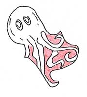 An octopus? I don’t think so. Faults and shortcomings abound here. When people think of an octopus, what is its most identifying feature? Eight legs. Simple. Therefore, the eight legs of an octopus should be clearly defined. However, here, Sirett simply uses surface embellishment to show this feature, a common fault amongst lesser tessellators. Although legs are indeed seen, they are not defined as entities in their own right. When silhouetted, there are no legs here whatsoever (contrast this with the excellent octopus of Alain Nicolas). All we have here is an arbitrary shape with leg–like additions to the interior. Pathetic. 2. Bird, page 71, after Sirett  A bird? I don’t think so. Faults and shortcomings abound here. The tile itself is not evenly remotely reminiscent of a bird, at least of this view, as seen from above. One could possibly make a case for a bird here in a different portrayal, but Sirett (unsurprisingly) missed this. The bird detail is contrived to fit the tile. Essentially, this is just bird motif detail added to an essentially arbitrary tile. Also, the ‘tessellation’ is of a pseudo nature, with artistic licence used in the form of gaps (‘breathing room’) of a non-minimal nature. Can it get any worse? Indeed it can! The artist couldn’t even be bothered to portray anatomically correct interior detail of the wings. Oh, and birds’ eyes as seen from above are not circles… Pathetic. 3. Stafish, page 73, after Sirett  A starfish? I don’t think so. Faults and shortcomings abound here. Pehaps at first sight there is indeed a resemblance to a starfish, but this is only superficial. Sirett’s ‘starfish’ has strange, spiky ‘protrusions’ that have no place in the actual creature. A true starfish has no such protrusions, with instead arms that taper from a central core. A slightly lesser concern is that Sirett’s ‘starfish’ has six arms, which is a somewhat atypical representation. No reference is made to the more usual occurrence and portrayal of a typical starfish, these possessing five arms. That said, starfish can indeed be portrayed with considerable number of arms, beginning with three, up to a maximum of forty (authorities disagree on the exact number), and so a case can be made for correctness here, although by far the most typical is five. Again, no discussion is made to this use of an atypical starfish here. The starfish is left without any interior detail. Although a minimal approach is indeed possible in portraying motifs per se when the outline is suggestive of something (see Nakamura), when the outline is non-suggestive (as here), interior detail is a must. Again, Sirett lets herself down here by its omission. Sirett refers to ‘tentacles’ in the text, although more correct is to describe these as arms or rays. One could cavil about this, but it’s really just another bit of lack of knowledge/slipshod research of hers. A Starfish? No, it’s just a tessellation with an order 6 rotation. Pathetic. 4. Bird and Star, page 75, after Sirett  Arguably the worse of the lot! This is truly unbelievable. A bird - where?! The ‘bird’ seems to have three wings. One wing is emerging from its beak… It also seems to be lacking a tail. A star – where?! I’ve yet to see a ‘spiky’ star as here. Furthermore, the ‘star’ is given six points. Invariably, a stylised star is portrayed with five points, tapering towards a point from a central core. This is just a shape with a lot of spikes. A lesser concern is that the combination has no confluence – what connection does a bird and star have? None whatsoever. (Ideally, there would be a confluence of sorts, either directly (fish/fowl) or of opposites (angel/devil). Therefore, this particular combination jars. If you are going to do this non-confluence type, then at least have the motifs recognisable. Compare Nakamura’s Bird and Star. Perhaps Sirett could be excused somewhat in that most artists include what I term as ‘aberrations’ in their oeuvre, by this I mean a tessellation that is so lacking in quality as to essentially worthless, likely included for the sake of sheer number. For example, Nakamura, who I rate the highest of all, includes many that are undeserving, specifically of cats. Even Escher has some, such as ‘dog-like’ lions, but excusable on account of his inexperience, these being amongst his earliest efforts, and, amongst others, No. 103, which is not excusable, with considerable experience under his belt. However, these aberrations, in percentage terms of their oeuvre, are very small indeed, and are essentially of no significance. However, Sirett does not even have the luxury of an ‘occasional’ aberration’. In contrast to the above artists, her oeuvre, of just four tessellations are all aberrations. Not a single tessellation here is of any worth. The standard is quite appalling. What can one say of this quite sorry mess? This is unforgivable. This situation is made even worse in that impressionable people will look at this and think that with the authority of a book, these must be somehow be ‘good’, and so try and emulate them, and then believing that what they produce is something of worth. And so the same execrable examples are perpetuated throughout the years. Further slackness is evidenced by stating on page 69 that Escher’s periodic drawing 110 is undated. Really? This is news to me. This can be seen on the drawing itself as 1961 - see Visions of Symmetry. A case of simple lack of checking, of which Sirett couldn’t even be bothered to spend a few seconds finding out. Oh, and no books are referenced at all. Can this artist not get anything right? Perhaps some excuse can be made as regards her background. Is she a ‘Sunday painter’, and so predisposed to amateurish standards? Well no. The book states that she was ‘trained in Fine Art at the University of Newcastle-upon-Tyne. Studied painting and drawing at the Royal Academy Schools, London’. Dear God. What are they teaching at these places? I thought you had to be good to get into university. Shame on you, Natalie Sirett for these pathetic tessellations. And shame on you, Arcturus Publishing Limited for publishing this abomination (the publishers, I might just add, of the excellent Incredible Visual Illusions by Al Seckel). Whatever possessed them… Finally, Sirett is completely unknown in tessellation circles. How she can have the audacity to pronounce herself as an authority on the subject with these truly sorry examples is unbelievable. Does anyone wish to defend her? Do you agree with me?. E-me. Tessellation premise stated As with Beyer and Sirett, just about everyone seems to want to show their tessellations without thought as to the quality issue. The web seemingly abounds with worthless tessellation art. I have seen some absolute shockers, of artwork without any merit whatsoever. I don’t understand. If it’s so poor why show? What is the point? How can a formless shape, reminiscent of absolutely nothing in particular, suddenly become deemed worthy of the title ‘Escher-like’, with the implication of quality, with the addition of minor surface embellishment, such as an eye? If you are no good in tessellation per se I don’t mind. For example, there are lots of subjects that I am poor in. My knowledge of Algebra, for instance, is most limited. However, I don’t bother all and sundry with my thoughts on this. Why can’t people approach tessellation in the same manner? By all means, study tessellations, and try your best, but if your efforts are lacking in inherent quality, why show the world? The tessellation premise is most simple, and one a 10-year-old child can understand. Simply, in silhouette, the shape, ideally of a whole bodied motif, should resemble the motif in question. Got it? How difficult is that to understand? Why do people insist on showing animals best described as (inadvertent) mutants that bear only the slightest resemblance to their silhouette? For exemplar purposes, I use a fairly popular motif, a cat. ‘Cats’, where the only cat-like aspect is the head. ‘Cats’ where the front legs are horribly deformed and twisted. ‘Cats’ where the tail is halfway up the back. ‘Cats’ with perspective conflicts. ‘Cats’ that look more like dogs. What is the point? Typically, one cat-like element may be discernible, with the rest essentially unrecognisable, and these are then shown without further comment, of which the implication is that these are ‘good’, by this single representative element. I have also seen tessellations that although titled as a specific creature, are not as described, and are more truly concoctions. For example, a ‘shark’, with a shark’s head and body, with the tail at an anatomically incorrect right angle. Err, this is self evidentially not a shark. Why describe it as such? Again, this is misleading. Described as an imaginary creature, well yes, perfectly acceptable, but to describe this as something it is not grates on me. Can it get any worse? Indeed it can! For example, I have seen a multi-motif tessellation, of a human figure bird, and fish that astounds me, in a negative sense. This is of a ‘partial person’, of an arbitrary head and shoulders, and with limbs out of proportion, which is pretty poor fare, being neither a whole-bodied motif nor a (lower category) head. This is then coupled with a ‘fish’ that lacks a tail. This grates with me on two counts: Firstly, the motifs as individual elements are lacking. Secondly, there is no confluence between the respective motifs (albeit of a lesser concern), and yet the artist has no compunction of showing this. Words fail me… Frequently, I have to control myself not to burst out laughing at some of these efforts. If you must show these, then at least have the good grace to say that these are of a lower standard, and don’t regard them as of high standards of the art. Contrived motifs Frequently, the artist hides behind the skirts of people’s ignorance. For example, without being an expert in the field, who can say, for example, the true outline/proportion of a butterfly? What is the normal angle of the taper of the wings? Not many people know this with any degree of certainty. Certainly, they carry an overall impression of a butterfly in their mind, but without being unduly concerned as to specifics. This being so, the artist in effect takes advantage of this ignorance, showing butterflies, or whatever, of incorrect proportions. When examining other people’s butterflies, these will typically be seen to decidedly contrived, and so not true-to-life. Interestingly, Escher himself has an example of this type, No. 12. At first glance the impression is ‘true-to-life’ butterfly, but it is in reality of a contrived nature. No butterfly has level, ‘square-sided wings’ as here, and yet at first glance this would appear ‘correct’ to the initiated. A better, truer to life example is of Nos. 70 and 79, where the taper is evident, albeit now of asymmetric wings. That said, nearly all tessellations are of a contrived nature, due to the restrictions imposed by the discipline. The challenge to the artist is to portray the motif as true-to-life as is possible, with the bare minimum of distortion or contrive. Silence Why do nearly all tessellations artists feel compelled to stay silent over their works? At best, one is treated to a one or two-line comment, often of a throwaway nature, that shed little or no light on the tessellation. Most people, even Escher, show their tessellations without further comment. What is wrong with critiquing your tessellations? I know of only one person who does this. Can you guess who it is? Have you seen my own accompanying comments… Different types - heads, gaps and overlaps, and placements For example, a ‘head’ tessellation is given equal status by default as with a ‘whole-bodied’ motif. A moments contemplation should show that this is not so. Consider the complexity of a whole body, say of a human, with head, body, and (four) limbs, as against a single head, with no other concerns. It’s blindingly obvious that the former test one’s mettle, whilst the latter does not, and yet again, no concession is made to this decidedly inferior type. People with higher standards, like me, Bilney, Crompton, Escher, Nakamura, and Nicolas simply do not show any* such examples. The reason is that these are beneath our dignity, they lack challenge, and so are of a second rate nature, with rare exceptions. We set ourselves higher standards than most people, and yet are compared in the same breath as with such types. Gaps and overlaps Frequently, extensive use is made where the tessellation principle is relaxed, to greater or lesser degrees, with gaps (‘breathing room’) and overlaps. Why is no concession made to examples of these easier types? Again, these are presented in the same breath as with a skilfully executed, double-contoured line throughout which simultaneously represents two different aspects. By their very nature, these ‘relaxed types’ are obviously of a much easier category, in that the premise of tessellation, of a double contour line throughout, is ignored, and yet again, no concession is made to this decidedly inferior type. People like Bailey et al simply do not show any** such examples. Again, the same explanation as above applies here. Placements Occasionally I see examples where a picture is described as a ‘tessellation’ that has no connection to tessellation whatsoever! This I term as a ‘placement’, typically of a human figure, where these adopt poses as according to underlying symmetry, for example of squares, where for each side a human figure is placed, usually in a contiguous manner. This has no pretence whatsoever to tessellation, and yet this is widely classified as ‘tessellation’! Again, great as a symmetry drawing, no objections whatsoever, but it’s not a tessellation. That said, although I rage against the easier to achieve examples such as ‘heads’, gaps and overlaps, placements, I do not unduly mind if it’s good quality tessellation, with due acknowledgement as to lower type of difficulty. There is still a place for these types. If a head is good, then OK. If gaps and overlaps is minimal, then OK. Less so with placements, as no pretence is made to tessellation. But please, make it a insignificant part of your work, and if you do use it, just acknowledge it, and not simply pass of these inferior types as equal to whole-bodied, recognisable silhouettes, of a double contour throughout. Summary Although the above comments may seem harsh, if not acerbic, I have no axe to grind with these people and there various inferior types of tessellation. All I am interested in is raising the standard. If strong words are needed, then so be it. Please, now you know, show me quality… * Strictly speaking this is not entirely true, as Escher and Nicolas do indeed show examples of this sort, but of a minimal way. Escher’s Eight Heads is one of his very earliest works, and so can be discounted, as he had no thought through the issues at the time. Nicolas shows two heads, but of a purpose. Firstly, an Escher portrait, rather than a generic head. Secondly, an illusion type, where this has other aspects than a generic head. ** Escher shows a single example, but as this is negligible in percentage terms, I thus ignore it here. Agree'disagree? E-me. Last Updated: 1 July 2010. Revised and expanded: 27 July 2010 |