Introduction An open question to ask when designing tessellations, and more specifically upon completion of the design, is to whether or not add a highlight to the eye of motifs. Although this is undoubtedly a secondary issue (with the design per se assuming prime importance), nonetheless, by its addition, this may result in a slight improvement as regards the quality of the motif. Therefore, I now examine this issue to see if this conjecture is germane. I begin by first examining the work of Escher, Nakamura, and myself, followed by some ‘before and after’ examples, of my own, thereby enabling comparisons to be made.
Escher’s Usage: 17, Eagle, 1938 32, Fish, 1940 72, Fish, of Fish/Boat, 1948 73, Flying Fish, 1949 82, Fish, of Fish and Bird, 1951 83, Thirty- Six Different Motifs, 1951 (some motifs with eye highlights, but not all) Note that No.27 possibly has a highlight on the insect of Insect/Fish. As such, this aspect is left somewhat ambiguous by Escher. Interestingly, he used this feature on some of his tessellating based prints (with Bool catalogue numbers): 360, New Year’s Greeting Card; 364, Fish and Frogs; 372, Predestination; 422, Plane Filling I; 422, Plane Filling II; 433, Fish and Scales.
Nakamura’s Usage: No highlights at all. Curiously, Nakamura does not use this feature at all in his 250+ works.
Bailey’s Usage: This device is invariably used in my own work, as I consider it adds a ‘zest’ to the finished work. As ever, the aim of quality tessellation is, or should be, the accumulation of advantages of portrayal, no matter how small (such as with the serration effect as discussed in essay**). This highlight feature is undeniably small, but nonetheless I consider it greatly enhances the tessellation. On occasions, some of my finished works do not possess such a feature, and so at first sight it would appear that I contradict myself here. However, these examples are of relatively early works, in which I did not consider the matter. In my more mature period, I now invariably show this wherever possible. Occasionally, it is not possible to do so, due to the scale of the motifs. As one is drawing a large number of motifs, the individual motifs has to be of necessity to be of a rather small scale. Therefore, for example with human figures, of which the size of the eye compared to the body is very small, there is simply not enough ‘room’, and so this is then omitted.
The Three Artists So, as all three of the above artists are people with obvious ability, arguably on a par with each other, and so what explains, in relative terms, this enormous difference of usage? As such, usage ranges the whole gamut, from nothing at all (Nakamura), minor use (Escher), and extensive use (Bailey). Who is right? Is their even a right or wrong? Perhaps this can be best explained as regards the difference in styles, as although all three of us use stylized motifs, each of us is slightly different: Escher’s motifs show relative detail and are broadly consistent throughout the years, with the interior elements added, even from his very first, rudimentary drawing. Escher's motifs are generally ‘working drawings’ rather than finished works of art per se Nakamura’s motifs are generally simple in detail. Indeed, some of these are minimalist in nature, with no detail whatsoever, and some have just an eye without any other detail. However, most are of a comparable Escher-like amount of detail. Therefore, not all of Nakamura’s motifs are suitable, although where such a feature is indeed possible; he never chooses to use this. Therefore, one can assume then that he does not favour such a type. Bailey’s motifs are somewhat like Escher, in that interior detail is consistent over different motifs. However, I prefer a more finished nature of motif. As these are of a finished nature, so the possibility of using this feature arises.
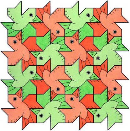
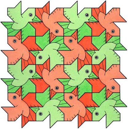
Before and After - Comparing To this end, I now compare ‘before and after’, with a variety of motifs. The left motif is without highlight, whilst the right has highlights
Birds
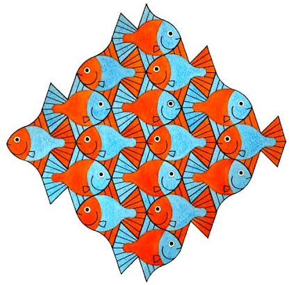  Summary So, does the addition improve the tessellation or not? In a word, yes. To me, the motif is now more ‘alive’, as it echoes a real-life motif. Although one could perhaps advance a counter argument to this is that with a stylized motif, perhaps such a life-like feature is inappropriate, and so a better outcome would be to leave the eye ‘plain’. Indeed, this is a valid point. However, even so, I consider this looks better with a highlight than without. Another aspect in favour to this is that aside from tessellation art, cartoon characters are often portrayed with such a highlight, of which why do the artists so add if this feature is not advantageous?. So, add a highlight… Agree/disagree? E-me. |