Concerning some of Escher's tessellating-based prints, a frequent 'device' will be seen that at a ‘beginning point' motifs 'emerge' from a grey ground, these gaining in intensity along with a ‘development' in which the outline of the motif increases in its angularity until a stark black and white is reached, whereupon the ‘composition' is shown in a fully developed state. Typical examples of this include Development I, Liberation, and Day and Night.
Of some importance is to exactly how Escher achieved these effects, as they are critical to the ‘success' of these type of prints. The following thus explains the 'theory and practice' underlying these. For reasons of conciseness, such effects are referred to as 'Black, Grey and White' rather than the more precise, although longer terminology, of 'Grey developing to stark Black and White'. Note that although Escher wrote an essay concerning titled 'White-Grey-Black', in De Graphische (The Graphic Arts) No.13, September 1951 (reprinted in Escher on Escher, pages 16-18), this does not contain the principles behind the effects of the prints, but is instead a discussion of the applications of printing on a white surface.
Recreating the Principle of Black, Grey and White
As such, although black, grey and white along with development are generally used together, it will be found that an analysis of both aspects is best treated independently of each other. Upon conclusion, black, grey and white and development can thus be combined as a single composition. Even if Escher did not quite present the material as shown below, undoubtedly his must be of a minor variation of the method I outline, as what follows is infallible for recreating the procedure. Pleasingly, it is most simple, of which ‘mathematics' as such is barely noticeable. Even if the method below is not understood, it should still be possible to simply select an appropriate format and simply use as required. The aim of this is to give the reader the means to do so likewise with their own tessellations, in effect ‘building upon' the original tessellation by an additional stage.
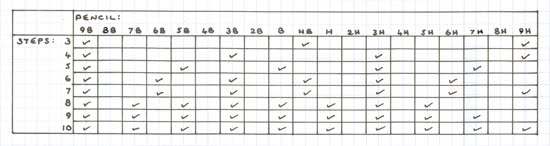
Although not strictly necessary, it will be found to ones advantage to attempt a recreation of some of the diagrams, as then an understanding of the process will be obtained rather than a slavish following. For this, 5mm quadrille paper will be found to be ideal, the scale being convenient, neither too large nor small. To assist in such matters, a chart of suitable pencil ranges and the appropriate number of steps as appropriate is given below. Note that although unstated, the 'final' pencil should be regarded as white, and not a shade. For example, with three steps, the range would be 9B, HB and white, not 9H as the chart gives (the chart is kept as simple as possible to present a uniform appearance, as the inclusion of white per se would require a relatively more complex example).
|
|
Other Possible Formats
For now at least, only those based upon a square is shown, although other formats are indeed possible, these being based on equilateral triangles and hexagons. Essentially the same method can also be applied, adapted to the inherent difference of polygons. These will be shown at the next update. Further to a square being used, as a square is a quadrilateral, the same black, grey and white effects can also be applied to any tessellation of an arbitrary quadrilateral.
The Presentation of the Diagrams
For convenience, a consistent approach in presentation and terminology is adopted throughout, the method being given in a series of three steps, no matter what the format:
|
|
|
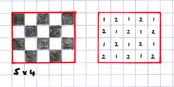
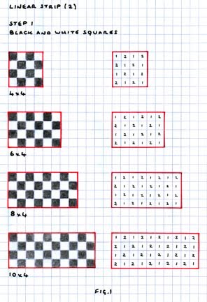
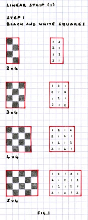
Step 1
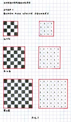
A black and white diagram of the format, accompanied by 'theory' in terms of numbers. |
|
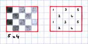
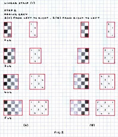
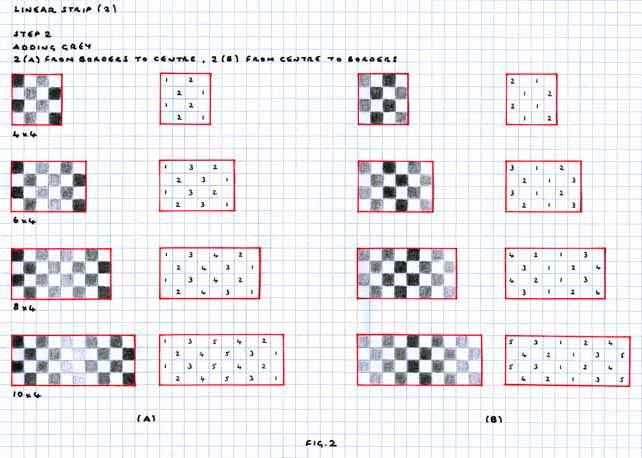
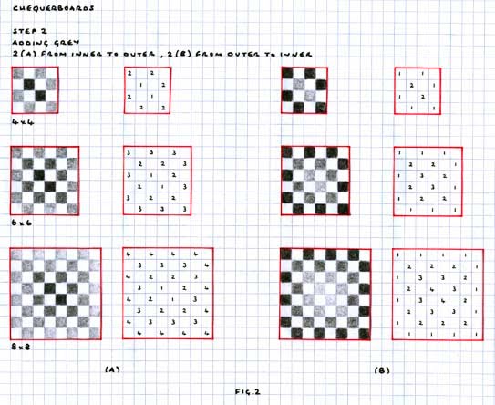
Step 2
Adding grey to the above diagram, from either the centre or border. Here, the grey is added left to right.
|
|
|
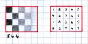
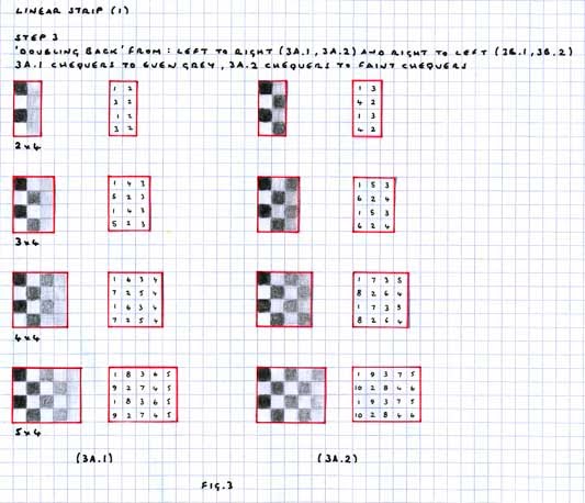
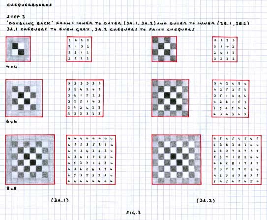
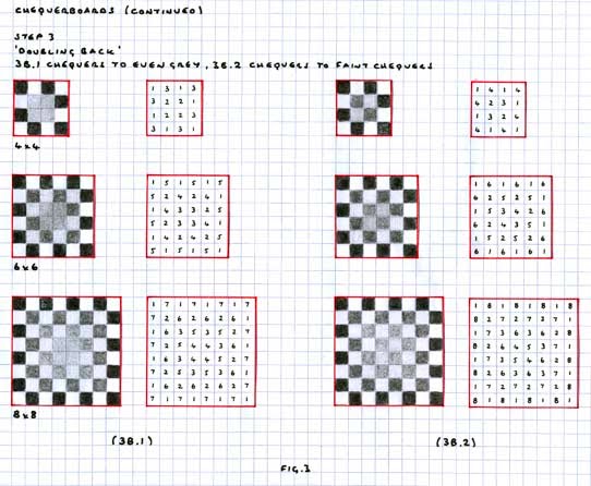
Step 3
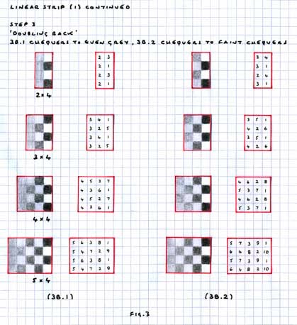
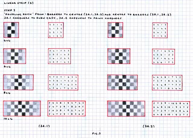
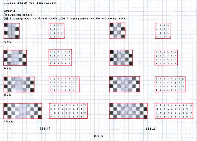
Further grey is added by what I term as ‘doubling back, in which upon the grey having reached the border the degree of declining intensity continues, thus ‘doubles back' on itself. Two types of this are possible, of what I term on the sheets themselves as 'faint chequers' and 'even border.' For the sake of definition these are shown below the main diagram.
|
|
|
Each diagram is accompanied by a natural increment or progression of the format, such as with the 'linear' type 4 x 4, 6 x 4, 8 x 4, from which, if so desired, can thus be continued to infinity. These are shown from the minimum size possible, using three or four examples. Consequently, an arbitrary number of examples are shown, as it will be found in practise that very large examples, say, 16 x 4 are neither necessary or would be usable.
Each example is in two parts, practise and theory, with the black, grey and white diagram (left), accompanied by the underlying degrees of intensity of the black, grey and white, with numbers representing the different shades, with 1 being Black, 2, 3, 4... being shades of grey, whilst the largest number is white. Each of the types is shown with an 'inverse', with for example the linear types gaining in intensity from left to right or right to left. Likewise with the chequerboards, these gaining in intensity from ‘outer to inner' and ‘inner to outer'.
|
| |
1. Linear Strip (1) One End
Here the process is applied to the beginning of the strip, of both left and right sides.
|
 |
|
|
|
|
|
|
|
|
|
|
|
| |
2. Linear Strip (2) Both Ends
Here the process is applied to both ends of the strip, this being in contrast to the preceding example, of only one 'beginning'.
3. Chequerboards
Here the process is applied to chequerboards, of both 'inner' and 'outer' regions.
|
|
| |