Introduction
Although anybody who is interested in tessellation can compose representational tessellations to some degree (as at its very simplest all that is required is to add an eye and some suggestive body markings to a tile), it is insufficient to regard all efforts as being of the same inherent quality. However, most people do not seem to recognise this matter, thinking that because some remotely vaguely recognisable creature (generally ill-proportioned) has been achieved that it somehow puts them on a par with Escher or other leading lights in the field. Therefore, what is required to determine the matter of quality is some kind of objective test. As such, this is simple to undertake, with which any tessellation can be examined with the minimum of time and effort, with what I term as the Silhouette Test.
The general procedure of the 'silhouette test' is to take a single tessellating tile and then simply 'colour' this in black i.e. a silhouette. Upon completion, the silhouette should, ideally, be instantly recognisable as of the creature it is supposedly portraying i.e. a bird, fish or whatever. If so recognisable, this is almost always the signature of a high quality tessellation, and should vigorously be striven for. As such, although such a test is most apt, and in practise will be found to be sufficient time and time again, it does not cover every contingency. On occasions where the motif with say the body twisted, or foreshortened and is thus shown not in profile or in a typical viewpoint then such assessments may not necessarily apply. However, as a rule, such examples are inferior as in a sense their deficiencies are hidden - for example, with a human figure, the arm may be placed across the body, of which when seen in silhouette will not be discernible.
The following thus illustrates the principles, by directly comparing inferior and superior examples, using frequently occurring motifs, with examples from other people (redrawn), and then comparing these with examples of my own inherently higher quality that show true worth.
Occasionally I make reference to the contributors mathematical qualification - the purpose of this is to emphasise that despite being of an advanced nature to most people, such ability is not a prerequisite to producing quality tessellations. Indeed, the converse is typically true.
Birds
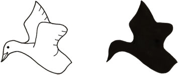
Inferior
The example above shows an 'bird' composed by Sheila Haak (a High School mathematics teacher), in the Mathematics Teacher article 'Transformation Geometry and the Artwork of M.C. Escher'. As such, although the article discusses composing representational tessellations, in conjunction with Escher's drawings, paradoxically this is an exemplary example of how not to compose. Although a bird motif is indeed recognisable, as its elements of head, body, wing and tail can be seen, this type is to be regarded as inferior. Shortcomings include:
(i) Upon examining the silhouette, a bird motif is barely discernible. The reason for this is primarily that the wings are not discernable, as they are held against the body in the line drawing, essentially mere decoration. Also the other elements are barely, if at all, recognisable. In contrast, my own bird motif can be seen to be instantly recognisable, as the birds beak, head, body, wings and tail are all readily identifiable in silhouette.
(ii) Poor definition of the wings. As such, these tend to merge with the body, and quite where the wings begin are not clear. Furthermore, the wings do no appear to be in alignment.
(iii) Lack of anatomical correctness of the drawing itself, as what detail there is, of the wings, is shown incorrectly, presumably 'guessed'. Furthermore, the lower wing and tail are not delineated at all. This thus simply shows Haak's lack of understanding of basic bird anatomy, a common fault. It simply should not be excused.
Superior
The example above shows an example taken from Birds 2 No.1. Here both of the wings are shown in an 'up' position, and as a consequence of these being partially hidden when viewed in silhouette, the silhouette is perhaps not quite as clear as a 'outstretched' one would be. However, the silhouette still remains readily bird-like, of which the head region is unambiguously recognisable. Consequently, this is thus superior.
Fish
Inferior
The example above shows a ‘fish' composed by * , found upon a tessellation image search on the web. This particular example is typical of the inferior type commonly to be found, albeit no pretence is made as to its inherent worth, as with qualified mathematicians showing a like quality. Again, upon examining this example, it may appear at first glance to be a perfectly acceptable fish, as it does indeed possess all the necessary fish elements, such as a head, eyes, fins and tail. However, such apparent ‘quality' is misleading, as when the silhouette test is applied, what was recognisable as a fish is now wholly unrecognisable. So, what has occurred? As such, the various elements shown are best described as interior markings added to a formless shape, which is fundamentally different to the showing of distinct elements, as detailed above, of the fish. Essentially, the artist has added detail to poor raw material. Shortcomings include:
(i) Silhouette. Upon examining the silhouette, a fish motif is non-discernible. Indeed, this is The reason for this is primarily that the wings are not discernable, as they are held against the body in the line drawing, essentially mere decoration. Also the other elements are barely, if at all, recognisable. In contrast, my own bird motif can be seen to be instantly recognisable, as the birds beak, head, body, wings and tail are all readily identifiable in silhouette.
(ii) Poor definition of fins – a few vague lines suffice to show the upper fin, these being shown as part of the body of the fish, which is anatomically incorrect. These should have been shown as separate elements i.e a fin and body, rather than these being merged as here. Furthermore, the lower fins of the fish are not shown at all.
(iii) Poor definition of the tail. Indeed, more precisely the tail is not is not shown at all. Here, the tail is portrayed merely as part of the body, which is anatomically incorrect. In reality, the join between body and tail is noticeable, and should be shown as separate elements.
(iv) Untypical fish shape. This example is of a most unlikely fish, as although fish can indeed be seen of all shapes and sizes (which explains their suitability for representational tessellation); the most typical one is of an elongated nature, with fins and tail as separate elements. In contrast, this is most squat, thereby lessening the resemblance. Although it could be argued that the artist is attempting to show a somewhat unusually shaped fish, such a ‘boxfish', such matters essentially mask the all-important typical aspect.
(v) Lack of basic knowledge of fish anatomy. In addition, even though of poor raw material, artistically this could even so be improved quite easily, by paying more attention to the interior detail. Presumably, the artist is unaware of basic fish anatomy. Noticeably, the operculum and mouth are omitted. Additionally, the eye is portrayed most simply, as a black disc, where with a modicum of effort a more realistic eye could have been shown, for example with an eye ring and/or a highlight. However, even with the improvements mooted, the fish would nonetheless remain of inherent poor quality.
In short, this is as poor an example of a fish as could be.
Superior
 This shows a fish taken from Fish1, No.2. Here all the main elements, of the head, body, fins and tail are all instantly discernable.
Human Figures
Inferior
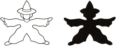
put illustration
The example above shows a ‘people' tessellation composed by Wendi Perrin, redrawn from the 'Math Cats' website, with an apparently young children interface. This being so, perhaps it is somewhat unfair to be critical of this example, bearing in mind the intended audience. However, the impression being given is that this is of a worthwhile standard, which it quite plainly is not. indeed, this particular example is typical of the inferior type commonly to be found. Upon examining this example, it may appear at first glance to be a perfectly acceptable as a person, as it does indeed possess all the necessary people elements, such as a head, body, legs and arms. However, such apparent ‘quality' is misleading, as when the silhouette test is applied, what was recognisable as a person is now wholly unrecognisable. So, what has occurred? As such, the various elements shown are essentially formless. Essentially, the artist has added minor detail to poor raw material, and even then not in a consistent way. Shortcomings include:
(i) Poor definition of the head. Indeed, there is no definition whatsoever, as the head consists of apex of a triangle, with a few cartoon-like markings to suggest eyes and a mouth.
(ii) Poor definition of the arms and legs. In contrast to the head region, these are at least somewhat broadly suggestive of the limbs. However, this is merely illusory, as they bear no comparison to real life people as regards to likeness, anatomical correctness or scale. Indeed, the legs are particularly poor, hopelessly contorted in a most awkward position. The arms are slightly better, albeit still of gross distortion. As such, these can at best only be described as appendages.
(ii) Poor definition of the body. Quite simple, the body has no definition at all - no shoulders, no waist. Typically, the body tapers to a waist - this instead expands from the head region downwards.
(iv) Lack of interior detail. Aside from the eyes and mouth, no other detail such as for the body or legs exists. A possible reason for this is that the outline is inherently unsuitable for such additions, and so the artist is of necessity compelled to leave these areas vacant.
What can one say of all this? Quite simply this is truly dreadful, with no merit whatsoever. Although the site appears to be aimed at young children, with perhaps less rigour than otherwise to cater for such an audience, this should not be an excuse for the adult tessellator to show slipshod work of unacceptable quality.
Superior
This shows a human figure taken from the Human Figures, No. 2. This is, or should be, regarded as of undoubted high quality. As seen by the line drawing the figure in proportion. When shown in silhouette, the resemblance to a human motif is striking, with a hat, head, body, arms (and hands) and legs (and feet) all instantly discernable.
Dogs
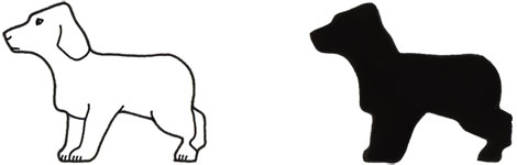
Inferior
 This shows an example by Patrick Murphy (incidentally, with a MSc in mathematics) in Modern Mathematics Made Simple, page 197. Now, upon examining the example by Murphy, it may at first glance appear to be a perfectly acceptable dog, as it possesses, or at least has interior markings, of a head, body, legs and tail. However, such apparent 'quality' is misleading, as upon comparing the line drawing and silhouette, it can be seen that the latter is now barely recognisable as a dog. Indeed, to my eye the silhouette is more reminiscent of another creature altogether, a frog. So, what is it that explains the difference? Essentially, Murphy's dog is lacking in definition, as the elements are very poor in this matter. Essentially, he has added detail to poor raw material. Shortcomings include:
• Poor definition of the underside of body and legs. Here the underside of the body and legs combine as a single mass, thus rendering no distinction between the elements. As such, this is the major shortcoming.
• Poor definition of neck. Essentially, the neck is ignored, with the head joined immediately at the body.
• Poor definition of chest. Essentially, the chest is ignored, as the head immediately joins the legs.
• Poor definition of the head. The head possesses no muzzle or stop or chin (although some breeds do not have a stop, and so it could be argued that this example is thus not a shortcoming. However, as most breeds do, this should ideally be included).
•.Poor definition of body. Essentially, elements are drawn onto a body that lacks clarity. Furthermore, towards the rear of the dog is a pronounced 'gouge' in the back before the tail.
Aside from the inherent shortcomings is the lack of anatomical correctness concerning the drawing of the details:
• The hind legs are shown incorrectly, being far too much towards the top of the dogs' back
• The legs are shown as mere appendages
• Conflicting perspectives, with the eye shown as seen from the front, whilst the rest of the detail is as portrayed from the side
In short, this is as poor an example of a dog as could be.
Superior
This shows a dog taken from Dogs, No.1. In contrast to Murphy's example, this can clearly be seen as superior, albeit it does indeed have shortcomings. Firstly, when seen in silhouette, a dog is clearly discerned. Essentially, all the elements of a dog in silhouette are instantly recognisable - the head, neck, chest, legs and body. However, my own example is not absolutely ideal, as it lacks a tail, albeit in this instance such an omission can be said to be non-critical, as it is not a 'substantial part of a dog, although ideally it should be shown. The back legs are noticeably contrived, and are not anatomically correct. However, despite these shortcomings, this remains a motif worthy of praise, as dogs per se are a most difficult motif to tessellate, and as by and large it remains broadly 'correct' in detail and proportion, it is without doubt far superior to Murphy's dog. Agree/disagree? E-me.
Created: 5 June 2007 (People) Last Updated: 24 November 2008, 21 December 2012
|