Birds 3 consist of 'finished' bird motifs that have inherently real-life appearance, with subtle, curving outlines, in effect echoing the outline of the real-life bird. As a consequence of this subtle, curved nature, these will be found to be more inherently life-like than with the preceding more 'severe' geometric outlines of Birds 1 and 2. However, this is not to say that these are any 'better' than those types, as they are of different types, as one is not comparing like for like.
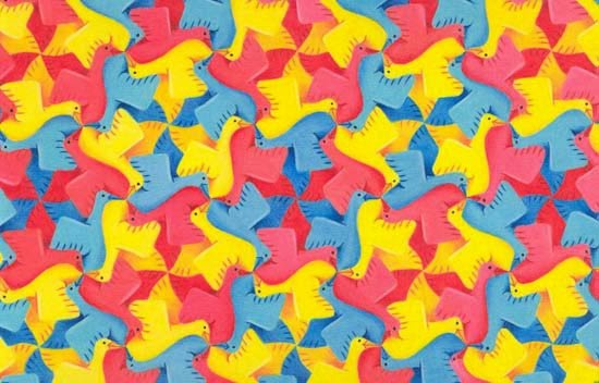
No.1
|
This example is of a very high quality, and indeed, it is one of my favourite examples of this particular motif, as it appears to be so true to life, with no ‘compromises' as regards veracity being necessary, as is so often the case.
Colouration
A minimum of two colours is required.
Although it is possible to colour this with a minimum of two colours, in this instance I have decided to use three, as by so doing ‘greater symmetry' can be discerned, with effectively ‘rings' of coloured birds of the same colour that essentially ‘enhance' the tessellation, at least in a colouration sense, albeit to be effective a greater number of birds of necessity is thus required, as shown. Another possibility was to use six colours, thus emphasising the six orientations. However, although feasible, this would be somewhat impractical (in terms of producing by hand), as to show the symmetry unambiguously would thus require even more motifs than is shown.
The rendition here (using coloured pencil) can be seen to be of a more considered nature than with most other of my tessellations. As can be seen, a deliberate three dimensional effect has been undertaken, with the shading suggesting the contours of the bird.
|
|
|
|
|
|
|
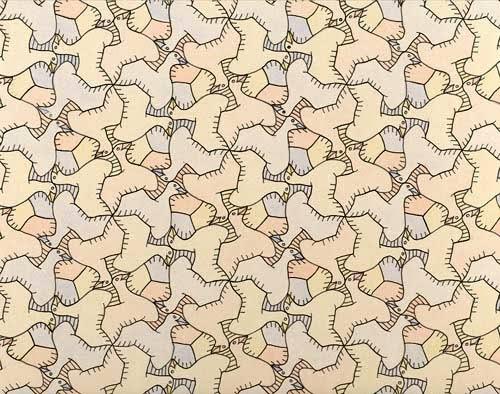
No.2 |
|
Colouration
A minimum of three colours is required.
A simple, basic colouration, of the 'one motif, one colour' type. As the colouration requires a minimum of three colours, red, yellow and blue are selected, these being at equal distances around a colour wheel to thus emphasise colour contrast. |
|
|
|
|
|
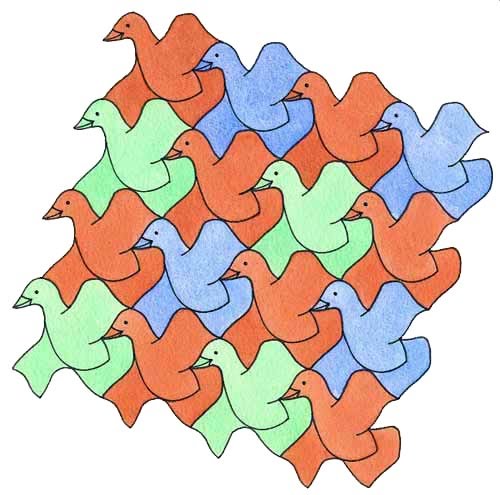
| No.3 |
Colouration
A minimum of two colours is required.
Although two colours would suffice, for the sake of variety a more complex (in relative terms) three colouring is shown as regards the 'weighted distribution'. This involves the use of colours in different proportions, with brown, green and blue respectively in ratios of 50%, 25% and 25%.
|
| |
|
|
|
|
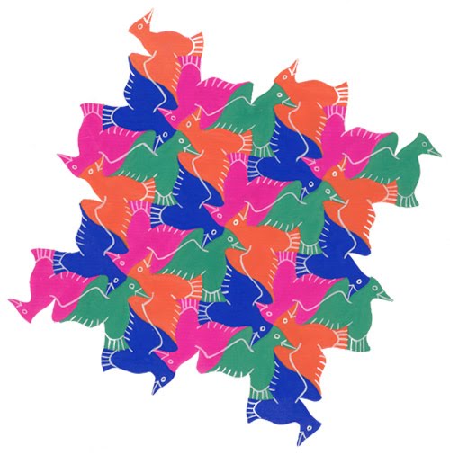
| No.4 |
Colouration
A minimum of three colours is required.
Although three colours would suffice, four are used so as to be compatible with the four orientations of the motif. Three colours would be 'inelegant' as according to the inherent symmetry.
| |
|