Introduction
Having previously discussed the theory underlying development in the Essay 'How Escher Did... Development', this section shows an arbitrary selection of linear and chequerboard examples and formats, shown in their finished state. Hand-in-hand with the process of development is the utilisation of appropriate colouring, which should be related to the outline in terms of intensity. The selection here was carefully chosen to enhance the intensity of the respective coloration, namely with with blue and white for the linear strips (Nos.1-2). Furthermore, an additional linear strip is shown (No.3), whereby the complementary colours of blue and orange are desaturated back to a mid grey. The chequerboards (Nos.4-5) utilised complementary colours in juxtaposition (in this instance blue and orange).
Linear Strip
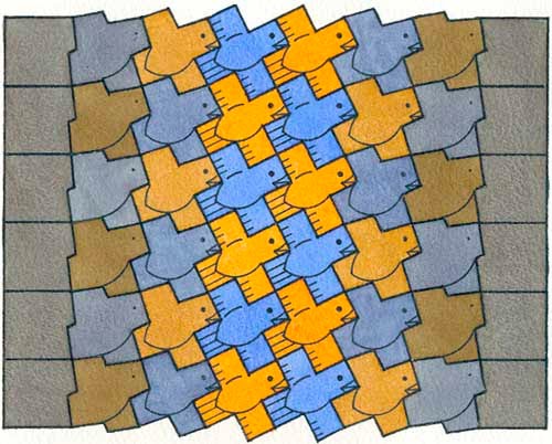
The linear strip examples show a 8 x 6 format, with developments from extremities to centre (No.1) and from centre to extremities (No.2). As such, the colouration 'matches' the angularity of the lines, with a mid-blue chequerboard starting point followed by more intense colours as the composition develops.
Figure 1a
8 x 6
A 'straightforward' development, with blue and white gaining in intensity from a pale blue chequer border at the extremities gaining in intensity towards the centre, in conjunction with the increasing degree of angularity of outline, from which the process then unwinds.
Figure 1b
8 x 6.
A 'straightforward' development, with blue and white gaining in intensity from a pale blue chequer border at the centre, gaining in intensity towards the extremities, in conjunction with the increasing degree of angularity of outline, from which the process then develops. Essentially, this is the inverse of No.1.
Chequerboards
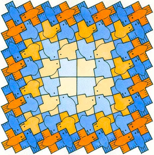
The chequerboard examples show a 8 x 8 format, with developments from extremities to centre (No.2a) and from centre to extremities (No.2b). As such, the complementary coloration of blue and orange matches the angularity of the lines, with a pale blue and orange chequerboard starting point followed by more intense colours as the composition develops.
Figure 2a
8 x 8.
Here the development gains in angularity of outline and colour intensity from outer to inner. Those familiar with Escher's Development I will see similarities here, in that this is fundamentally the same type of composition, albeit of different motifs, format and in coloration (with Escher's print being of lizard motifs, 10 x 10 and of black, grey and white) whilst retaining the same principles.
Figure 2b
8 x 8.
Here the development gains in angularity of outline and colour intensity from inner to outer. Essentially, this is the inverse of No.2a.